Is Design Subjective? Or Is It Just an Excuse?
Design has rules
Published
Jun 12, 2025
Topic
Unpopular Opinions
Overview
When I started freelancing, I believed something a lot of junior designers quietly believe:
“Design is subjective, everyone just has their own taste, right?”
But after working with real clients, messy briefs, contradicting feedback, and actual users, I learned something that completely flipped my approach:
Design might look subjective but great design is rooted in objective truth.
Here’s the shift I went through. Maybe you’re going through it too.
Deep Dive
Let’s get something straight:
Yes, taste is subjective.
Yes, two designers can make totally different versions of the same thing.
Yes, clients will always say “Make it pop.”
But the moment you stop designing for the dribbble screenshot and start designing for function, clarity, and behavior, you realize something powerful:
Design has rules. Patterns. Proven behavior. Metrics. Psychology. Accessibility. Logic.
And the more you ignore those things under the excuse of “subjectivity,” the more broken your product becomes, no matter how “pretty” it is.
Here are five moments that made this painfully obvious:
1. Users Don’t Care About Your Taste. They Care About Their Task.
“But the font is elegant!”
Cool. Can your user read it without zooming in?
Real users don’t sit with your designs and appreciate your alignment choices.
They have 30 seconds. A goal. A need. Maybe a bad Wi-Fi connection.
Every time I saw someone fumble with a button I thought was “visually clean,” I realized that my aesthetic wasn’t just unhelpful, it was a barrier.
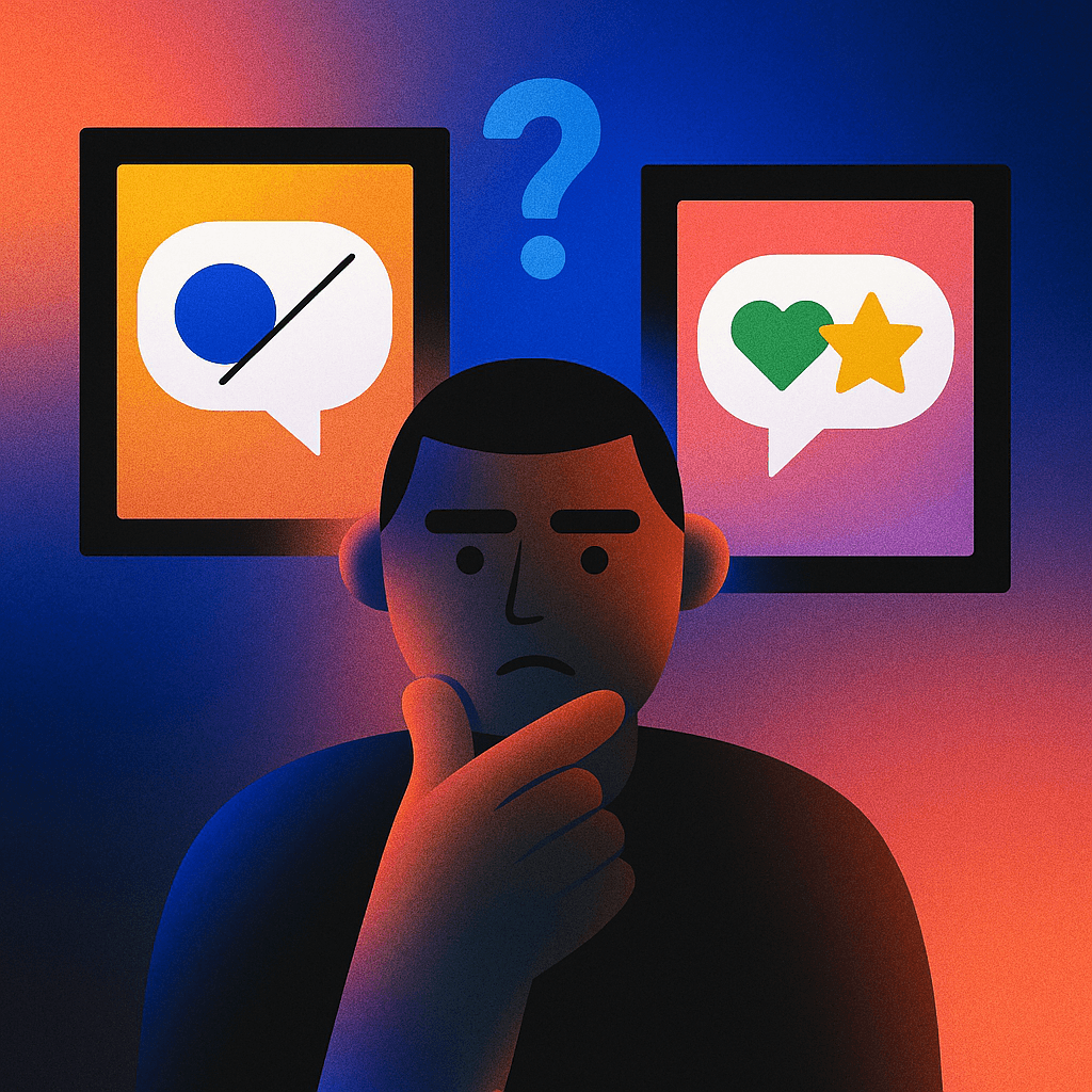
2. Consistency Beats Creativity (Most of the Time)
We love reinventing the wheel.
But real-world design systems are not playgrounds — they’re contracts with users.
A blue underline? That’s a link.
A red badge? That’s a warning.
A hamburger icon? That opens a menu.
Sure, you can break the rules, but only after you've earned the right to. And if your “creative” solution makes users stop and think?
That’s friction. Not brilliance.
3. Design That Doesn’t Get Tested = Design That Doesn’t Work
One of my cleanest, most “refined” flows ever got zero adoption.
Why?
Because I didn’t test it with users, only with my team.
Turns out: people didn’t even see the CTA because it looked too much like static text.
Lesson learned: if you never observe how people interact with your design, you’ll keep guessing. And most of your guesses will be wrong.
4. Data Doesn’t Lie (Even When It Hurts)
A client once insisted that we change their onboarding from 2 steps to 5 “because it looked more thorough.”
Signups dropped.
We reverted.
Signups bounced back.
Subjective opinions crumble in front of data. Numbers are not feelings. Their feedback. And the longer you avoid them, the more subjective and risky your decisions become.
5. You Can Have Great Taste and Still Design Bad Products
This was a tough pill.
Just because your design is modern, minimal, Apple-like…
…doesn’t mean it’s right for the problem.
Your taste is a lens, not a solution.
Design only becomes good when it helps someone do something easier, faster, and smarter.
Once I started measuring my design by impact, not aesthetic, everything changed.
Conclusion: The Real Job of Design
Design isn’t just about what you like.
It’s about what works, especially when no one’s paying attention.
Design is a conversation between a product and its user.
If it’s confusing, unclear, or overly clever, the conversation breaks.
Since I stopped hiding behind subjectivity and started leaning into clarity, patterns, feedback, and behavior, I’ve had fewer “pretty but broken” projects… and way more real results.
So next time someone tells you “design is subjective,” just smile and ask them:
“Cool. But does it work?”